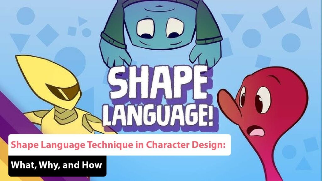
In 2025, character design continues to be at the core of storytelling in animation, gaming, branding, and digital illustration. But what truly makes a character visually striking and emotionally resonant? It often comes down to one crucial design principle: Shape Language in Character Design.
This blog dives into the science and creativity behind using shape language effectively. From the Fundamentals of Shape Language to exploring Character Design Shape Psychology, we’ll guide you through the how, why, and what of using this technique to elevate your work.
Whether you’re an aspiring artist or a professional designer, understanding the Impact of Shapes on Character Design is essential to creating compelling, memorable characters in 2025.
What Is Shape Language in Character Design?
Shape Language refers to the use of specific geometric shapes to communicate personality traits, emotions, or narrative roles within a character’s visual design. These shapes form the visual vocabulary of your character and help audiences instantly understand who they are before they say a word.
The Three Core Shape Categories:
- Circles / Rounded Shapes: Friendly, soft, innocent, safe
- Squares / Rectangles: Strong, stable, grounded, dependable
- Triangles / Angled Shapes: Dangerous, sharp, energetic, cunning
When you look at famous animated characters, you’ll notice these shapes guide their forms. Think of Mickey Mouse (circles), Superman (squares), or Maleficent (triangles).
Using Shape Language in Character Design gives your visuals intentionality. It helps create intuitive, readable designs that connect with audiences instantly.
Why Shape Language Matters in 2025
As character design becomes more integrated into virtual reality, interactive content, and diverse cultural storytelling, subtle cues like shape become vital for accessibility and emotional resonance.
Key Reasons to Use Shape Language:
- Visual Clarity: Instantly tells viewers what kind of character they’re looking at
- Emotional Connection: Shapes can influence how people feel about a character
- Storytelling Efficiency: Helps convey archetypes or backstory without dialogue
- Global Communication: Works across languages and cultures visually
In the competitive and immersive digital landscape of 2025, the power of shape to deliver meaning faster than text or voice is unparalleled.
Character Design Shape Psychology: What Shapes Represent
Understanding Character Design Shape Psychology allows artists to make informed choices based on the message they want to convey.
🔵 Circles:
- Represent innocence, friendliness, softness
- Common in children, sidekicks, comic relief characters
- Examples: Baymax, Olaf, Kirby
🟫 Squares:
- Represent strength, reliability, tradition
- Often used for heroes, authority figures
- Examples: Sully from Monsters Inc., Mr. Incredible
🔺 Triangles:
- Represent danger, tension, unpredictability
- Often used for villains, tricksters, or fast-moving characters
- Examples: Scar, The Joker, Megatron
Knowing this helps you shape characters to fit the roles they’re meant to play.
How to Use Shape Language in Art
Applying Shape Language in Character Design isn’t just about drawing shapes—it’s about building a cohesive language across all parts of a character.
Where to Apply Shape Language:
- Silhouette: The outer contour of the character should match the primary shape theme.
- Facial Features: Eyes, nose, mouth—all should reinforce the base shape.
- Posture and Gesture: Even body movement can reflect shape-based personality.
- Props and Costumes: Accessories and clothing should echo the core shapes.
Example Process:
- Choose the dominant shape based on personality.
- Sketch the character’s silhouette using this shape.
- Add supporting details (eyes, clothes, gear) using complementary shapes.
- Ensure consistency across the character’s design.
Fundamentals of Shape Language: The Design Building Blocks
Let’s go deeper into the Fundamentals of Shape Language to help you build a stronger foundation in your design work.
1. Visual Simplicity
Shapes should be clear and readable even at small sizes. This helps in branding, app icons, and animation readability.
2. Contrast for Character Dynamics
Opposites attract! A triangle villain clashing with a circle hero can visually reinforce conflict.
3. Shape Combinations
Characters can mix shapes to represent duality or development. A circle-head with a square body could suggest a kind soul with a strong foundation.
4. Scale and Proportion
Exaggerate certain parts to amplify the character’s traits—like large round eyes for innocence or broad square shoulders for power.
Mastering these principles allows you to craft characters that not only look great but feel intentional.
Character Design Techniques and Tips for 2025
Here are fresh tips tailored for the current tools and trends of 2025:
✅ Use AI-Assisted Sketching
AI tools like Adobe Firefly or Character.ai can generate shape-based character roughs. These help speed up exploration.
✅ Design for Multiple Platforms
Make sure your character’s shape reads well in 3D, AR, and flat 2D assets.
✅ Create a Shape Language Chart
Before designing, make a reference sheet with shape-based traits to align your team.
✅ Emphasize in Storyboards
Use shape contrast in storyboards to highlight character dynamics visually.
These modern Character Design Techniques and Tips will help keep your designs sharp and relevant.
Best Shape Language Examples in Animation
Nothing teaches better than observing the pros. Let’s look at Best Shape Language Examples in Animation that demonstrate mastery.
🔹 Pixar’s Inside Out
Each emotion is designed with different shapes: Joy is a starburst of circles, Anger is a short square block, Fear is a tall, thin triangle.
🔹 DreamWorks’ Kung Fu Panda
Po is entirely made of rounded forms, communicating his gentle, goofy nature. Tai Lung, the antagonist, features angular designs to show tension and danger.
🔹 Disney’s The Incredibles
Mr. Incredible’s boxy design contrasts Elastigirl’s more flexible, rounded design—visually expressing their personalities and powers.
🔹 Arcane (Netflix)
The show masterfully uses angular, gritty designs for villains and organic, smooth curves for protagonists—each matching character development.
These examples reinforce how Using Shape Theory for Better Characters creates iconic storytelling.
Using Shape Theory for Better Characters
Shape theory isn’t a rigid rule—it’s a tool. Combining shapes allows you to show character growth, internal conflict, or duality.
Multi-Shape Characters:
- Shrek: Mix of circle (softness) and square (strength)
- Batman: Square body (power) with triangle cape (fear and mystery)
- Elsa (Frozen): Circle face (warmth), triangle gown (power, conflict)
Tips:
- Use primary shapes for dominant traits.
- Secondary shapes can hint at hidden layers or evolution.
This strategic combination strengthens psychological depth in design.
Integrating Shape Language in Team Projects
In large animation or game studios, consistency is key. Here’s how to apply shape language across teams:
📘 Create a Shape Style Guide
Include base shape templates, psychological associations, and approved combinations.
🎨 Use Modular Asset Libraries
Group costume parts, props, and face elements by shape category.
🤝 Collaborate with Animators Early
Ensure movement complements the design—sharp shapes should move fast and aggressively, soft ones with bounce or sway.
Collaboration enhances the Impact of Shapes on Character Design across the full pipeline.
The Future of Shape Language in Character Design (2025 and Beyond)
🔮 Predictive Tools
AI-driven design assistants that suggest shape combinations based on character briefs.
🔮 Responsive Design
Characters that shift shape subtly based on emotional state—perfect for games and VR.
🔮 Cross-Cultural Shape Psychology
As global content rises, designers explore how different cultures interpret shape symbolism.
By staying ahead of these trends, your mastery of Shape Language in Character Design will remain timeless and future-ready.
Final Thoughts
In 2025, Shape Language in Character Design remains one of the most impactful tools in any visual storyteller’s toolkit. It’s not just about what looks cool—it’s about what communicates clearly, emotionally, and universally.
Understanding Character Design Shape Psychology enables you to speak to your audience before a single word is spoken. Whether through soft circles, grounded squares, or edgy triangles, every shape choice shapes perception.
So next time you design a character, ask yourself:
- What do their shapes say about them?
- How do these shapes make the audience feel?
- Is your shape language consistent throughout their design?
Master this, and you’ll be well on your way to crafting timeless, iconic characters that connect with audiences across mediums and cultures.
Ready to sketch with purpose? Start building your own shape language library today.
Frequently Asked Questions (FAQ’s)
What is shape language in design?
Shape language refers to the strategic use of geometric shapes in visual design to convey specific emotions, characteristics, or concepts. Designers utilize various shapes such as circles, squares, triangles, and organic forms to create a visual vocabulary that communicates meaning without the need for words. For instance, circles often suggest softness, unity, and continuity, while sharp angles and lines might imply danger, aggression, or tension. By effectively harnessing shape language, designers can enhance their storytelling capabilities, making their visuals more engaging and impactful for their audience.
How does shape language affect character design?
Shape language is a pivotal tool that helps define a character’s personality traits, moral alignments, and emotional resonance. Designers often choose shapes based on the traits they wish to convey for example, characters designed with rounded shapes may come across as friendly, approachable, and nurturing, while those with angular shapes may seem more dynamic, aggressive, or villainous. This intuitive understanding allows the audience to quickly grasp a character’s essence and motivations, fostering a deeper connection to the narrative. Additionally, shape language can create visual contrast between characters, emphasizing the differences in their personalities and roles within the story.
Why is understanding shape language important for designers?
Grasping the concept of shape language is crucial for designers, as it empowers them to create more cohesive, impactful, and engaging visuals. By understanding how shapes influence perception, designers can effectively communicate emotions, set the tone of a piece, and enhance the overall storytelling experience. A well-executed shape language can lead to memorable and relatable designs that resonate with audiences on a deeper level. Furthermore, this understanding aids in making informed design decisions, allowing designers to align their visuals with the intended message and emotional response, ultimately elevating the quality and effectiveness of their work.
Can shape language be applied to other design fields?
Yes, shape language can be applied across various design fields, including graphic design, animation, architecture, and product design. Regardless of the medium, the principles of shape language can enhance visual communication, helping designers convey messages and evoke emotional responses effectively.
How can I improve my understanding of shape language?
Improving your understanding of shape language involves a combination of study, practice, and experimentation. Begin by analyzing existing designs across various mediums and observe how different shapes are used to convey emotions and ideas. Delve into character design books, online resources, or workshops that focus on design fundamentals and visual storytelling. Practical exercises can also be beneficial; try creating your designs with a deliberate focus on shape choices. Solicit feedback from peers or mentors to gain insights into your use of shape language. Additionally, consider engaging in design challenges or projects that push you to experiment with different shapes and their meanings, thereby deepening your understanding of how shape language can enhance your overall design practice.
