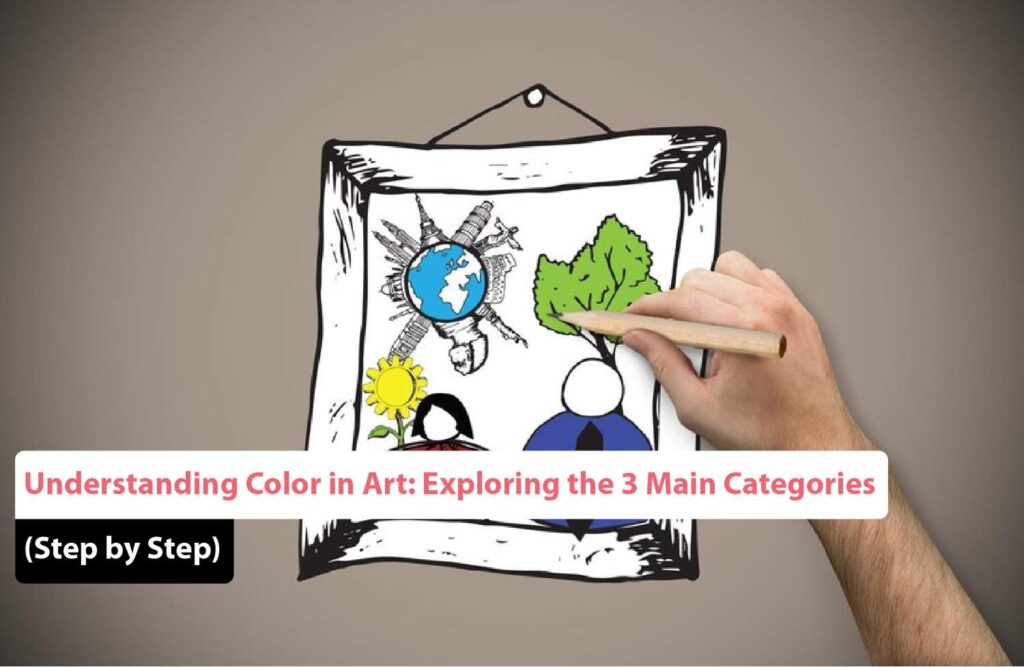
Color is one of the most powerful tools in any artist’s toolbox. It speaks a language of emotion, depth, movement, and harmony. In 2025, artists continue to use color theory not only as a foundation but also as an evolving medium for creative expression. Whether you’re a beginner or an experienced professional, understanding the primary, secondary, and tertiary colors explained is critical to mastering the art of visual storytelling.
This blog serves as a comprehensive and updated resource—a step-by-step guide to color harmony, color psychology, and mixing techniques for artists. We’ll explore how modern artists apply these principles in contemporary design, digital painting, traditional media, and beyond.
What Is Color Theory in Art?
Color theory in art 2025 refers to the updated understanding and use of color relationships in visual composition. This includes how colors interact, how they affect emotions, and how they can be harmonized to create visually pleasing and impactful artwork. The core components of color theory still include the color wheel, value, hue, saturation, contrast, temperature, and harmony.
In 2025, digital tools like Adobe Color and AI-assisted design platforms have made exploring color combinations more accessible than ever, but the fundamentals remain timeless. Let’s begin with the basic categories.
The 3 Main Categories of Color
1. Primary Colors
Primary colors are the base from which all other colors are created. In traditional art, the primary colors are:
- Red
- Blue
- Yellow
These colors cannot be created by mixing other hues together. Artists use them to generate an entire spectrum through combinations. For example, mixing red and blue creates purple; red and yellow create orange.
In modern digital media, the RGB (Red, Green, Blue) model is often used, especially for screens and digital illustration. However, for physical painting and pigment, the RYB (Red, Yellow, Blue) model is still widely practiced.
2. Secondary Colors
Secondary colors are formed by mixing two primary colors in equal proportions:
- Orange (Red + Yellow)
- Green (Blue + Yellow)
- Purple/Violet (Red + Blue)
These colors offer additional vibrancy and are key to expanding an artist’s palette. Understanding their positioning on the color wheel allows for better compositional balance and contrast.
3. Tertiary Colors
Tertiary colors are created by mixing a primary color with a neighboring secondary color. They include:
- Red-Orange
- Yellow-Orange
- Yellow-Green
- Blue-Green
- Blue-Purple
- Red-Purple
Primary, secondary, and tertiary colors explained together form the standard 12-color wheel. Mastering this allows artists to navigate an infinite number of hues and shades with confidence.
Fundamentals of Color Mixing in Painting
Whether working with oils, acrylics, or digital brushes, understanding the fundamentals of color mixing in painting is essential.
Key Techniques:
- Tinting: Mixing a color with white to lighten it
- Shading: Mixing a color with black to darken it
- Toning: Mixing a color with gray for subtler variations
- Neutralizing: Adding a complementary color to mute or dull a hue
Color mixing isn’t just chemistry; it’s emotional. It creates the mood and tone of your entire piece. Artists should experiment frequently with swatches and palettes to discover unexpected yet harmonious combinations.
How Artists Use Color Psychology
Color doesn’t just appeal to the eyes—it affects the mind. Understanding how artists use color psychology can transform the emotional impact of a piece.
Common Psychological Associations:
- Red: Passion, love, anger
- Blue: Calm, sadness, trust
- Yellow: Happiness, energy, caution
- Green: Nature, growth, envy
- Purple: Royalty, mystery, luxury
- Black: Power, mourning, sophistication
- White: Purity, peace, simplicity
In 2025, data-driven user feedback and AI tools can even help measure the emotional effectiveness of color combinations in commercial and marketing artwork.
Step-by-Step Guide to Color Harmony
Creating a visually balanced image means mastering color harmony—how colors relate and interact to please the eye.
Step 1: Start with the Color Wheel
Familiarize yourself with color positioning and the three main categories (primary, secondary, tertiary).
Step 2: Choose a Harmony Strategy
- Monochromatic: One hue in varying tones, tints, and shades
- Analogous: Three colors side by side on the wheel
- Complementary: Opposing colors (e.g., blue and orange)
- Split Complementary: Base color + two adjacent to its opposite
- Triadic: Three colors evenly spaced (e.g., red, yellow, blue)
Step 3: Use Tools to Preview Palettes
Modern design platforms like Adobe Color, Canva, and Uizard AI (for UI/UX) offer palette testing and previews for any harmony method you choose.
Step 4: Test and Refine
Experiment with background, character, and object colors in sketches before committing to a final design. Don’t be afraid to adjust saturation and lightness for optimal effect.
Importance of Warm and Cool Colors in Art
Temperature plays a massive role in perception. The importance of warm and cool colors in art cannot be overstated. Temperature guides the viewer’s eye, sets mood, and creates spatial depth.
Warm Colors:
- Red, Orange, Yellow
- Evoke energy, excitement, passion
- Appear to advance in a composition
Cool Colors:
- Blue, Green, Purple
- Suggest calm, distance, serenity
- Tend to recede in an image
Artists often balance warm and cool tones to create contrast, focal points, or a sense of realism. For example, a warm-toned character against a cool-toned background will naturally pop.
In 2025, many concept artists and digital illustrators use color temperature overlays and AI filters to analyze and improve temperature balance in real-time.
Case Study: Digital Art Example (2025)
Let’s examine a digital fantasy illustration created using Procreate and Adobe Fresco.
- Color Wheel Base: Tertiary focus (Blue-Green and Red-Purple)
- Mood: Mysterious and ethereal
- Color Psychology: Blue-green for magic and nature; red-purple for mystery and mysticism
- Color Harmony Strategy: Split Complementary
- Tech: AI-assisted palette generation using Adobe Sensei
The final image shows a forest deity emerging from an enchanted pool. The cool background contrasts against the warmer highlights of the deity’s magical aura, guiding the viewer’s focus and evoking emotion.
Advanced Color Techniques for 2025
1. AI-Powered Color Mapping
Modern software lets artists upload a mood board and receive automated palette suggestions. This technology uses machine learning to analyze successful artwork from across the web.
2. Generative Color Blending
Platforms like Midjourney or DALL-E offer generative AI that visualizes blended palettes in unexpected ways, inspiring new approaches to harmony.
3. Color Accessibility Testing
Inclusive design now includes color-blind accessibility checks. Use tools like Stark or Color Oracle to ensure your harmony remains effective for all viewers.
Conclusion
In the ever-evolving world of art and design, the understanding of color remains both timeless and revolutionary. By mastering the fundamentals of color mixing in painting, exploring how artists use color psychology, and understanding the importance of warm and cool colors in art, you elevate your artistic communication.
Whether you’re creating traditional illustrations, digital paintings, marketing graphics, or UI/UX designs, color is the bridge between intention and impact.
Embrace the color theory in art 2025. Study the primary, secondary, and tertiary colors explained. Use this step-by-step guide to color harmony and discover your palette’s potential in shaping stunning, emotional, and unforgettable visuals.
Frequently Asked Questions (FAQ’s)
What is color theory?
Color theory is a framework for understanding how colors interact and how they can be combined to create visually appealing compositions. It includes concepts such as color harmony, contrast, and the color wheel, which helps in selecting and using colors effectively in art and design. Mastery of color theory allows artists and designers to create harmonious and impactful visual experiences.
How does the color wheel work?
The color wheel is a circular diagram that shows the relationships between different colors. It typically features primary colors (red, blue, yellow), secondary colors (orange, green, purple), and tertiary colors, arranged to help visualize color harmony and contrast. By understanding the color wheel, you can experiment with various color combinations and create dynamic visual effects.
What are complementary colors?
Complementary colors are pairs of colors that are opposite each other on the color wheel. When used together, they create high contrast and vibrant effects, such as red and green or blue and orange. These pairs can make your designs stand out and capture attention by creating striking visual contrasts.
What are analogous colors?
Analogous colors are colors that are adjacent to each other on the color wheel. They usually create a harmonious and cohesive look, such as blue, blue-green, and green. This scheme is ideal for creating smooth transitions and subtle gradients in your work.
What are triadic colors?
Triadic colors are three colors that are evenly spaced around the color wheel, forming a triangle. This scheme provides a vibrant and balanced color palette, such as red, yellow, and blue. Using triadic colors can bring energy and variety to your designs while maintaining visual balance.