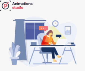
How long does it take to make an animated video?
One of the most asked questions in business is before they consider investing in animation. If you have a timeline for planning a marketing campaign,
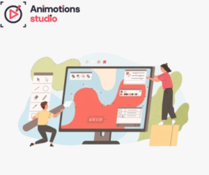
The Art of Visual Storytelling: Motion Graphics Services by Animotions Studio:
In the modern digital world, brands should be able to deliver a message promptly, concisely, and imaginatively. The plain text and mere visuals are no
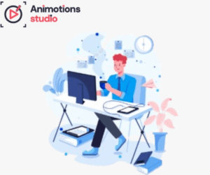
High-Quality 2D Anime Studio Services by Animotions Studio for Creative Storytelling
Anime has changed much more than entertainment; it is a strong storytelling medium employed by brands, creators, and companies worldwide. Anime-style animation has a way
Engage Your Audience with Animotions Studio’s Animated Explainer Video Services
In today’s digital marketplace, the battle is not just to gain attention but to retain it. Brands are always looking for an efficient method of
Frame-by-Frame Animation by Animotions Studio – Precision, Creativity, and Impact
In the world of digital reality, where rapid images and automated movement technologies prevail, there is a growing need among companies to seek out animation
Discover the Power of 3D Animation: Animotions Studio’s Creative Solutions for Modern Brands
To represent a brand in the digital-first era, a company is always trying to find new methods to convey the message, present the product and

Animotions Studio Offers Complete 2D Animation Solutions for Brands & Companies
In the hectic digital era of the modern world, brands are in search of how to convey their message, differentiate themselves in the market, and

Top Corporate Animated Video Production Services by Animotions Studio:
Today, in the competitive business world, the art of communication has become simple and interesting for business success. Companies are not just limiting their communication

From Concept to Screen: Animotions Studio’s Animated Commercial Video Services
The current digital market is quick with brands. There is a decline in attention rates, and the content is floating; hence, companies must deliver their

Animotions Studio Produces Creative and Stunning Animated Music Videos
Music has been an influential tool; however, when these two work together, they become a memorable visual experience. In the digital-first era, people no longer

Engaging Educational Animation Design & Production – Only at Animotions Studio
Education is no longer about textbooks and conventional learning classroom methods. In today’s digital-first era, the students want to see something that is interactive, visual

Experience the Wide Range of Animation Services by Animotions Studio for Your Brand Growth
In the modern world of digital technology, rapid growth, and time-saving, a brand should speak swiftly, concisely, and imaginatively. The viewers are no longer satisfied

Rick and Morty Season 8 Review – Animation Brilliance
Rick and Morty has never been a simple comedy, it is disorder, philosophy and simple animated genius combined into one. Season 8 is currently available
2D Video Animation Agency: The Future of Visual Storytelling
A 2D Video Animation Agency has become one of the most valuable creative partners for brands looking to communicate visually, educate audiences, and stand out
Hire 2D Animations Service for Global Market Reach
In today’s fast-paced digital world, animation is no longer just a creative element it’s a business growth strategy. Whether you are a startup or a
Best 2D Animated Video Production Company Elevate Your Brand with Animotions Studio
2D Animation Videos Company have become a powerful tool for brands to capture attention, tell compelling stories, and engage audiences. Whether you’re in marketing, education,
2D Animation Service – Breathe Life into Your Brand
Attention spans are shorter, competition is fiercer, and storytelling is more important than ever. Businesses across industries are using animation to create compelling visual narratives.
Boost Conversions with a Top-Tier 2D Animation Service
In the world of digital marketing and content creation, businesses are continuously looking for ways to stand out and make an impact. One of the
Choose the Best 2D Animation Service
Selecting the Best 2D Animation Service is essential if you want your explainer videos to not just look great, but actually drive results. Animotions Studio
How the Best 2D Animation Service For Marketing
Businesses need to stand out to capture the attention of their audience. One of the most effective ways to do this is by using a
Top 10 3D Animations Can Improve Brand Recognition in the Automotive Industry (Australia)
In the ever-evolving landscape of Australia’s automotive industry, standing out is no longer just about horsepower, performance, or engineering. It’s about how a brand feels,
Impact of 2D Animations Can Capture Attention Instantly in the Entertainment Industry (USA)
The entertainment industry in the USA is constantly evolving pushing boundaries, merging formats, and racing to captivate audiences across every platform imaginable. In this landscape
How Marketing Videos Can Tell Better Stories in the Fashion Industry (USA)
In today’s fast-moving fashion landscape, where attention spans are fleeting and consumer loyalty is hard-earned, brands are constantly seeking new ways to connect. From streetwear
Impact of Testimonial Videos Can Tell Better Stories in the SaaS Industry (USA)
In the highly competitive SaaS (Software as a Service) industry, standing out requires more than technical excellence. It takes storytelling, trust-building, and emotional engagement. In
Creative Motion Graphics Can Capture Attention Instantly in the Automotive Industry (Canada)
In an industry driven by speed, innovation, and visual appeal, the automotive sector is constantly seeking new ways to connect with consumers. The traditional methods
Ultimate Guide to 2D Animations Can Transform Presentations in the SaaS Industry (Global)
In today’s global SaaS industry, first impressions are digital and often visual. Whether it’s a pitch deck, investor presentation, product demo, or onboarding tutorial, the
Impact of 3D Animations Can Tell Better Stories in the Fashion Industry (Europe)
The fashion industry is built on imagination, emotion, and the ability to inspire. For decades, brands have relied on photography, fabric, and catwalk drama to
Top 10 3D Animations Can Improve Brand Recognition in the Architecture Industry (Global)
In the ever-evolving global architecture industry, competition is intense and attention spans are short. Architects, design studios, and multidisciplinary firms are increasingly recognizing that their
Top 10 Motion Graphics Can Transform Presentations in the Architecture Industry (UK)
The architecture industry in the UK is celebrated for its blend of historical heritage and forward-thinking innovation. From adaptive reuse of heritage buildings to cutting-edge
Best Explainer Videos Can Boost Engagement in the Education Industry (Europe)
The education industry in Europe is undergoing a digital transformation. With classrooms expanding beyond physical boundaries and hybrid learning becoming the norm, educators are continuously
Creative Whiteboard Animations Can Simplify Complex Ideas in the HR Industry (UK)
In the ever-evolving HR industry in the UK, professionals are tasked with the challenging responsibility of communicating complex, nuanced concepts to a wide range of
Affordable 3D Animations Can Stand Out Online in the Nonprofit Industry (Asia)
Nonprofits across Asia face a common challenge: how to cut through digital noise and reach the right audiences with compelling, memorable messaging without blowing through
Smart 2D Animations Can Tell Better Stories in the HR Industry Canada
The way organizations in Canada approach Human Resources is undergoing a digital transformation. From recruitment to employee training, storytelling plays a key role in conveying
Creative Whiteboard Animations Can Capture Attention Instantly in the Finance Industry (USA)
In an industry known for jargon, spreadsheets, and tight regulations, standing out as a finance brand is no small feat. Whether you’re a fintech startup,
Essential Testimonial Videos Can Tell Better Stories in the Education Industry (Global)
In today’s hyper-digital and competitive education landscape, facts and figures alone are no longer enough to inspire trust. Parents, students, and corporate learners alike crave
Why Explainer Videos Can Capture Attention Instantly in the Travel Industry (Australia)
Australia’s travel industry is bouncing back stronger and more digital than ever. With travelers becoming increasingly research-savvy, emotionally driven, and content-hungry, the way tourism businesses
Essential Whiteboard Animations Can Simplify Complex Ideas in the Technology Industry (USA)
Technology is constantly evolving and with it, the challenge of communicating new ideas. Whether it’s AI, blockchain, SaaS, cybersecurity, or cloud infrastructure, many tech companies
Ultimate Guide to Motion Graphics Can Boost Engagement in the Fashion Industry (Canada)
In Canada’s competitive fashion industry, the challenge isn’t just creating great apparel it’s capturing attention. In an era where content floods every screen, standing out
Ultimate Guide to Explainer Videos Can Capture Attention Instantly in the Gaming Industry (Asia)
Asia’s gaming industry is a force of nature. With markets like China, Japan, South Korea, and Southeast Asia leading global trends in mobile, PC, and
Essential Testimonial Videos Can Enhance Customer Experience in the Entertainment Industry (Australia)
In Australia’s vibrant and fast-paced entertainment landscape where competition for attention is fierce and audience loyalty is everything creating genuine emotional connections with customers is
Essential 2D Animations Can Stand Out Online in the Architecture Industry USA
In an increasingly visual and digital world, the architecture industry in the United States faces a pivotal challenge how to stand out online. From showcasing
Impact of Video Campaigns Can Tell Better Stories in the HR Industry USA
In today’s fast-paced digital workplace, traditional methods of communication no longer hold the attention of employees and job seekers. The human resources (HR) landscape in
Visual Language with Animation: How to Create Consistency
In today’s competitive digital landscape, creating a cohesive and recognizable brand identity is essential. One of the most powerful tools for achieving this is animation.
Behind the Animation: Meet the Creative Team Who Brings Stories to Life?
Animation is an incredible art form that has captivated audiences worldwide. But have you ever wondered what goes on behind the animation: meet the creative
Real-Time Animation: What It Is and When to Use It
In the ever-evolving landscape of digital media and interactive content, animation technology continues to push boundaries. One of the most exciting advancements is real-time animation,
Style Choices in Corporate Animation That Elevate Brands
Corporate animation has become an indispensable part of modern business communication. Whether it’s for internal training, marketing campaigns, investor relations, or client presentations, animation offers
Animation to Drive E-Commerce Sales and Conversions
The e-commerce landscape is more competitive than ever. Shoppers expect not only great products but engaging, seamless online experiences that guide their purchase decisions. To
Animate a Product Launch Timeline the Right Way
Launching a new product is a high-stakes moment for any brand. Whether you’re introducing a physical product, digital platform, or service upgrade, a launch requires
Animation in Client Pitches That Closes Deals
Standing out in a competitive sales environment takes more than data and bullet points. Clients want clarity, confidence, and creativity. That’s why using animation in
Animation for Reputation Management That Builds Trust
In the digital age, brand perception is everything. One viral comment, a wave of negative reviews, or a misunderstanding on social media can create reputational
Strategies for Animated Brands on YouTube That Work
For animated brands, YouTube is more than just a video platform it’s a powerful stage for storytelling, audience building, and marketing success. Whether you create
Animated Video Portfolio That Converts Clients
In a competitive creative market, showcasing your skills is only half the battle. The real goal is to turn that showcase into paying projects. Whether
Limited Animation Budget? Maximize Every Frame
Creating compelling animated content doesn’t always require a big studio or six-figure funding. While large budgets can unlock complex visuals and high-end production, many brands,
Effective Animated Learning Backed by Science
In today’s digital world, learning is no longer limited to textbooks, chalkboards, or lecture halls. From e-learning modules and training videos to explainer content and
Tell a Brand Story Without Saying a Word
When people think of storytelling, they often think of language words carefully chosen to paint a picture, convey an idea, or evoke emotion. But some
Healthcare Adopting Animation for Better Communication
The healthcare industry is changing rapidly. Between growing patient expectations, complex medical advancements, and the need for clearer communication, healthcare providers are searching for better
3D Animation in Real Estate and Architecture Explained
The architectural and real estate industries are evolving rapidly, driven by technology and consumer expectations. Traditional blueprints, physical models, and still renderings are no longer
Animation in Investor Presentations That Impress
Securing investor support is a pivotal milestone for any startup or growing business. But delivering a compelling investor presentation is no easy task. You need
Brand Recall Through Motion Design Made Simple
In today’s hyper-competitive digital space, it’s not enough for a brand to be seen. It needs to be remembered. That’s where brand recall through motion
Winning Animated Bumper Ad Secrets You Should Know
The rise of mobile-first content and fast-paced consumer behavior has transformed the way brands advertise. Attention spans are shrinking, and audiences often skip traditional ads.
Multilingual Animated Videos: Best Practices That Work
As global markets grow more interconnected, brands are no longer limited by geography. Businesses today reach customers across continents, cultures, and languages all through digital
Animate a Frequently Asked Questions Section Easily
Frequently Asked Questions (FAQs) are one of the most important content elements on any website or product page. They save time for both customers and
Vertical Animation for Mobile Platforms Is the New Standard
The way we consume content has changed dramatically over the past decade. What was once designed primarily for wide computer screens or TV monitors is
Animation Increase Social Sharing and Engagement Fast
In a world where attention spans are short and newsfeeds are crowded, getting your content noticed is no easy task. Brands compete every second for
Motion Graphics in Annual Reports That Engage Stakeholders
Annual reports have long served as essential tools for businesses to communicate financial results, strategic progress, and future goals to investors, employees, and other stakeholders.
Create an Animated Video: How Long It Really Takes
Creating an animated video is an exciting and creative journey. Whether you’re developing a product explainer, a brand story, an educational video, or a social
Highlight App Features & Benefits with Animation
This is why many companies today turn to animation to highlight app features & benefits in a way that’s engaging, memorable, and user-centric. Whether you’re
Crafting the Perfect Animated Call-to-Action: A Complete Guide
In a world where attention is fleeting and digital content is everywhere, your call-to-action (CTA) can be the difference between a viewer bouncing or converting.
The Role of VFX in Corporate Animation
When most people hear “VFX,” their minds jump to blockbuster films or high-octane video games. Explosions, aliens, interstellar travel all brought to life with visual
Voiceover vs. Text-Only: Which Works Better in Animation?
Animation has transformed how brands, educators, and storytellers engage with audiences whether it’s a 90-second explainer, an educational module, or a social media ad. But
What Makes Animation Effective in Financial Services
Using animation effective in financial services sector might seem unconventional at first but the results tell a different story. From explaining complex investment strategies to
Animate Corporate Social Responsibility with Impact: Powerful Ways to Tell CSR Stories Through Animation
In today’s brand-driven landscape, it’s not just about what you sell it’s about what you stand for. Corporate Social Responsibility (CSR) initiatives are how companies
Life with Animation: Transforming Static Infographics into Engaging Visual Stories
Infographics have long been a go-to tool for content creators, marketers, and educators to break down complex information into digestible visuals. But in a digital
Editing Tools Used by Animation Studios Today
When it comes to crafting mesmerizing animated stories from bite-sized explainers to full-length features video editing plays a pivotal role in shaping the final product.
Influencing the Animation Industry: The Role of AI in a Creative Revolution
The world of animation is evolving faster than ever. What once took months of meticulous drawing and frame-by-frame planning can now be generated in minutes.
Metaphors in Explainer Animation: How They Connect
In the world of explainer videos, clarity is king. Whether you’re introducing a new SaaS platform, simplifying a complicated process, or promoting a service, the
Rebranding with Motion Graphics: Benefits Explained
Rebranding is more than just changing a logo or swapping out a color scheme. It’s a complete reset of how your brand is perceived, how
Videos with Animation: How Humor Boosts Business Impact
In the business world, where polished presentations, statistics, and buzzwords dominate, humor often takes a back seat. But what if we told you that laughter
Creating Brand Consistency: The Power of Character Animation in Branding
In a crowded digital landscape where brands fight for mere seconds of attention, creating brands consistency a recognizable, relatable, and memorable identity is no longer
The Psychology of Color in Animation
Color in Animation is one of the most powerful tools in animation. It guides emotion, sets tone, builds worlds, and speaks to the subconscious often
Using Animation to Elevate Your Website’s User Experience
In today’s digital-first world, a brand’s website is more than a storefront it’s an experience. Users don’t just visit a site for information; they interact
What Makes a Great Logo Animation?
In a world where attention spans last seconds and first impressions are everything, your brand’s logo animation can say more in two seconds than an
A Beginner’s Guide to the Animation Production Workflow
Animation Production Workflow is everywhere from feature films and TV shows to social media ads, explainer videos, and mobile apps. Whether you’re a budding animator,
The Future of Brand Storytelling Through Animation
Storytelling with Animation is the beating heart of every great brand. It’s how companies connect emotionally with audiences, communicate values, and build lasting trust. But
Tips for Creating Scroll-Stopping Animated Social Ads
In today’s attention-starved digital world, getting someone to Animated Social Ads stop scrolling is no small feat. The average person scrolls through 91 meters of
Realistic 3D Character Animation: Techniques and Tools
In today’s world of animation, creating realistic 3D character animation isn’t just an artistic goal it’s a technical challenge that demands a fusion of skill,
Exploring the Best 3D Animation Companies in the USA
In today’s visual-first world, 3D animation has become a powerful storytelling tool across industries from film and advertising to real estate, medical visualization, gaming, and

35 Best Explainer Video Examples by Top Brands [2025 Updated]
Explainer videos are here to stay. everyone is using them startups, established businesses, mom-and-pop shops, NGOs, government institutions, giant corporations, and top brands. If you’ve

13 Best Educational Cartoons That Make Learning Fun and Engaging for Kids in 2025
Educational Cartoons for Kids: Where Fun Meets Learning: In a world where screens have become an integral part of children’s daily lives, parents often find
How To Animate on Procreate in Just 5 Minutes in 2025
Animation has never been more accessible, thanks to powerful digital tools like Procreate. Whether you’re an artist, designer, or someone simply curious about animation, you
The Growing Influence of AI on Video Scriptwriting Trends in 2025
Scripts always need special attention they are the solid foundation for creating an exciting video and they deserve it. Artificial Intelligence (AI) is revolutionizing industries
The 7 Best 9Anime/AniWave Alternatives to Watch Anime for Free Online in 2025
AniWave, formerly known as 9Anime, was an online platform for streaming anime series. Initially established in 2016 as 9Anime, the site rebranded to AniWave in
13 Animated Infographics You Need to See for an Educational and Fun Experience in 2025
The way we process and understand data has transformed in recent years, thanks to advancements in motion graphics for education. Animated infographics are revolutionizing how
17 Inspiring Illustration Trends to Explore in 2025
When skillfully created, illustrations are powerful tools for brand development, utilizing colors and shapes as strategic elements. A compelling illustration goes beyond mere decoration it

Video Editing Cost – (Hourly Rate vs Fixed Pricing for Professional Video Editors) in 2025
Video content is booming in 2025, from YouTube videos and corporate presentations to high-budget marketing campaigns. Whether you’re a business, a content creator, or a

How Can 3D Animation Be Used to Improve Educational Content in 2025?
As technology continues to evolve, the way we educate and engage students is also changing. One of the most transformative innovations in modern learning is

What Is Animation Used For? A Brief and Complete Explanation in 2025
Animation has become an integral part of our digital world. From education to entertainment, marketing to business, and even user experience, animation is everywhere. But
Rotoscope Animation: Exploring Its Remarkable Comeback in Modern Media, Art, and Storytelling
Rotoscope Animation: A Timeless Technique Making a Bold Comeback: Rotoscope animation, a classic style rooted in the late 1990s, is once again in the spotlight.
Is Virtual Reality the Future of Animation in 2025?
image source: toonz The animation industry is constantly evolving, and in 2025, one of the biggest game-changers is Virtual Reality Animation. With advancements in immersive
What Are Motion Graphics? Steps to Easily Create Your Own Motion Graphics Videos in 2025
Motion graphics are a dynamic visual communication style that effectively combines graphic design, animation, and sound to convey messages. Unlike traditional animations, motion graphics focus on movement

What Is Cel Animation? A Complete Guide to the Process in 2025
Image Source: Animost Animation has come a long way, evolving from hand-drawn techniques to modern digital animation. However, one of the most celebrated and influential
What is a VTuber Model? How to Commission a VTuber Model for Your Content in 2025
In the ever-evolving world of digital content creation, VTubing has taken the internet by storm. With the rise of virtual streamers, many aspiring creators are
Types of VTuber Models: Analyzing the Complete and Diverse Spectrum of Avatar Designs in 2025
VTubing: The Future of Content Creation Without Facing the Camera! The world of VTubing has expanded tremendously, with content creators using innovative VTuber Avatar Designs
Why Godot Video Player Is Better Than Shader Effects: Improve Your Game Development with Animotions Studio
Creating visually engaging experiences in game development is essential to capturing players’ attention. Developers often debate whether to use Godot’s Video Player or custom shader

Top 20 Brand Instagram Story Dimensions, Specs, and Requirements in 2025
Maximize the Full Potential of Instagram Stories for Your Brand: Instagram Stories continue to be one of the most engaging features on social media, helping
What is CGI? How CGI Works in Movies and Animation
CGI, or Computer-Generated Imagery, is the use of digital technology to create realistic or stylized visuals in animation and movies. It enhances storytelling by bringing
What’s The Difference Between CGI and 3D Animation in 2025?
Exploring the world of animation is an exciting yet complex journey, particularly when it comes to understanding the distinctions between CGI and 3D animation. In
How to Use Bing’s AI Image Generator for Design in 2025
Artificial intelligence (AI) has transformed the creative industry, and one of the most powerful tools available today is the Bing AI Image Generator. Whether you’re
12 Amazing Curated Collage Animation Videos to Inspire Creativity in 2025
Collage animation is one of the most visually stunning and artistically engaging forms of animation today. With its ability to blend different media elements, textures,

19 Best Types of Advertising Design – A Complete Guide with Effective Examples for Success in 2025!
In the fast-evolving world of marketing, Types of Advertising Design play a crucial role in attracting audiences and driving conversions. As businesses strive to stay

Why High-Quality Animations Are Essential for Successful Medical Marketing Campaigns in 2025!
In the ever-evolving healthcare industry, Medical Animation Marketing has emerged as a game-changer for engaging patients, educating medical professionals, and promoting healthcare services effectively. With
The Most Inspiring Animated Logos of All Time: Iconic Designs in Motion to Inspire in 2025!
Logos are the visual identity of a brand, and animation brings them to life, making them even more engaging and memorable. Best Animated Logos showcase

Top 12 Budget-Friendly Game Animation Tools for 2025: Perfect and Powerful Choices for Indie Developers and Small Studios
Gaming animation is an exciting and dynamic field where creativity meets technology to bring characters and worlds to life. However, finding the right animation tools,

How Animation Law Forced Representations Are Making Complex Legal Cases Easier to Understand – A Step-by-Step Guide in 2025!
Legal proceedings are often complex, filled with technical jargon and intricate details that can be challenging for juries, judges, and even legal professionals to grasp.

How Do Law Animations Help People Understand the Rule of Law?
The implementation of laws holds greater significance than the creation of new ones. Law serves as the backbone of society, providing a framework for acceptable
Top 10 Best 3D Animation GIF Creation Tools for Your Brand’s Digital Marketing Success in 2025
Create Stunning GIFs with Ease: The Ultimate Guide to 3D Animated GIF Makers In today’s fast-paced digital world, 3D animated GIFs have become a powerful

Best Free 3D Animation Software for Chromebook You May Not Know About in 2025
Image Source: Educators technology Chromebooks are widely recognized for their affordability, portability, and ease of use. However, many people assume they lack the power for
Indie vs AA vs AAA Games: Understanding the Differences in 2025
The gaming industry has evolved significantly over the past few decades, with games now classified into three major categories: Indie vs AAA Games, with the

How Much Corporate Video Production Costs? Pricing, Variations, Key Factors, and Insights in 2025
In today’s digital landscape, corporate videos have become a crucial part of marketing and branding strategies. However, businesses often wonder, How Much Does a Corporate
The Complete Guide to Explainer Video Production Costs in 2025
Explainer videos have become a powerful tool for businesses to communicate complex ideas in an engaging and visually appealing manner. However, one of the most

Morphing in Animation: A Detailed Guide, Explanation, and Techniques in 2025
Animation has evolved dramatically, with Morphing in Animation playing a crucial role in transforming objects and characters seamlessly. From traditional cartoons to high-end CGI, Animation
How to Create an Engaging Facebook Cover Video: Step-by-Step Guide in 2025
Your Facebook cover video is the first impression visitors get when they land on your business or personal page. A well-designed video can instantly capture

Creative Design Solutions with Perchance AI: Tips & Tricks Step-by-Step Guide 2025
Creating compelling visuals is essential, but it can be a challenge to consistently generate fresh, engaging ideas. There are moments when the creative spark feels

How Much Does Video Editing Cost in 2025?
The Goal of Quality Video Editing Creating Value and Impact: Image Source: Zamrznuti tonovi/Shutterstock With video content dominating digital platforms, businesses, influencers, and content creators

A Complete and Detailed Step-by-Step Guide to the Stop-Motion Animation Process in 2025
Stop-motion animation is one of the most creative and visually stunning animation techniques. Whether you’re a beginner or a seasoned animator, mastering the Stop-Motion Animation

What Are the Different Kinds of Video Game Genres in 2025?
The gaming industry is constantly evolving, with new and exciting Types of Video Game Genres emerging each year. Whether you’re a casual gamer or a

An Easy Guide: 5 Essential Stages of Video Editing for Beginners to Master the Process
We can all agree that video and film production can be both tedious and chaotic: Video editing has become an essential skill for content creators,

A Detailed Compilation of the Ultimate Collection of Animation Memes You Need to See Now in 2025
Visual arts and representation have always been crucial forms of expression, though the mediums and styles have evolved. From fine arts and sculptures to murals
VTuber Model Cost: How to Become a Successful Creator on a Budget in 2025
Hold up! The first question that’s likely on your mind is, “What’s the price tag of creating an awesome VTuber model in 2025? VTubing has

What Counts as a View on Different Social Media Sites in 2025?
Social media platforms are constantly evolving, and so are their rules for counting views on videos. Whether you’re a content creator, marketer, or business owner,

What Are Special Effects in Movies in 2025?
Movies have captivated audiences for decades through the magic of Special Effects in Movies. From jaw-dropping explosions to breathtaking fantasy landscapes, special effects bring filmmakers’
Doodly vs. DoodleMaker: Who Comes Out on Top in Whiteboard Animation in 2025?
Whiteboard animation is one of the most engaging forms of visual storytelling, widely used in marketing, education, and business presentations. Two of the most popular
Vmail: What Is It and Why Use It in 2025?
In the fast-evolving world of digital communication, businesses and individuals are looking for innovative ways to connect with their audiences. One of the most significant
How the Best Oscar-Winning Animated Movies of All Time Have Changed Animation History in 2025
The world of animation has evolved drastically over the decades, and nothing highlights this transformation better than the Best Oscar-Winning Animated Movies. Since the inception

What is the Visual Effects Pipeline in 2025?
Visual effects (VFX) hold the extraordinary ability to transport audiences into fantastical realms and present realistic CGI spectacles that push the boundaries of imagination. However,

Instagram Video Length: A Complete Guide for Posts, Stories, and Reels (Step-by-Step) in 2025
In 2025, Instagram remains one of the most influential social media platforms for content creators, businesses, and influencers. However, knowing the Instagram Video Length Guide
7 Powerful Ways to Use Motion Graphics for Social Media Ads and Brand Engagement in 2025
Looking to stand out on social media and create your digital marketing game? In 2025, digital marketing is more competitive than ever, making it essential
Why Ignoring Arcs in Animation Is a Serious Mistake: Enhancing Movement and Practicality (Step by Step) in 2025
Understanding Animation Arcs: The Key to Realistic Movement One of the biggest pitfalls in animation is failing to use arcs in animation explained. Whether you
How to Create an Effective Animated Video Marketing Strategy: Tips and Guide in 2025
Creating animated videos requires careful planning, thorough research, and a significant investment of time to create content that establishes a personal connection and resonates deeply

Complete Guide to 3D Product Animation for Better Marketing, Engagement, and Sales in 2025
Imagine being able to put potential customers immerse themselves in an interactive environment, exploring your products long before they decide to buy. It might feel

What is Commercial Animation in 2025?
The world of animation continues to evolve, and in 2025, Commercial Animation Explained takes on an even greater role in digital marketing, branding, and advertising.

How Does 3D Animation Enhance Brand Storytelling?
Keeping audiences engaged in today’s digital world is more challenging than ever. With constant content flooding consumers’ screens, businesses face an uphill battle to capture

Interactive Animation: Techniques, Trends, and Future Innovations (Step-by-Step) in 2025
Interactive animation allows users to actively participate in the content, creating a dynamic experience beyond passive viewing. By incorporating interactive elements, brands can foster deeper

Animation Ideas and Concepts for Beginners: Essential Tips for Success in 2025
Animation is no longer limited to large studios or professionals. In 2025, more people than ever are diving into the world of animation thanks to

SaaS Explainer Video That Drives Engagement and Conversions: A Step-by-Step Guide in 2025
The Importance of Explainer Videos in the SaaS Industry: In 2025, attention spans are shorter, and competition in the SaaS (Software as a Service) industry
How to Use Data Analytics to Improve Your Explainer Video Strategy: A Step-by-Step Guide in 2025
In 2025, video continues to dominate digital marketing, especially in the SaaS industry. However, creating high-quality content isn’t enough. To ensure your SaaS Explainer Video
8 Inspiring Blockchain Animation Explainer Videos for Your Business Success and Growth in 2025
As blockchain technology continues to reshape industries in 2025, businesses are racing to simplify complex ideas and communicate their value proposition. One of the most

The Role of Animation in E-Commerce Websites: Tips and Best Practices in 2025
In 2025, online shopping is more visual and interactive than ever. With consumers demanding faster, smoother, and more personalized experiences, e-commerce brands must stay ahead

5 Essential Tips to Create Highly Effective 30-Second Explainer Videos (Step by Step) in 2025
In today’s fast-paced digital world, attention spans are shorter than ever. That’s why creating concise, powerful content like 30-second explainer videos is a must-have in
8 Mistakes to Avoid When Creating an Explainer Video: Dos and Don’ts in 2025
Explainer videos have become essential for brands, SaaS products, and startups looking to simplify their messaging and engage modern audiences. In 2025, video content continues
How 3D Visual Content Can Transform Your Social Media Strategy in 2025
The social media landscape is constantly evolving—and in 2025, 3D content is emerging as a game-changer for brands, influencers, and creators. With higher competition, shrinking

Top 14 Best Marketing Animation Videos from Leading Global Brands in 2025
In 2025, animation has solidified its role as a cornerstone of digital marketing. With evolving visual trends, diverse platforms, and increasingly sophisticated audiences, animation is

Shape Language Technique in Character Design: What, Why, and How
In 2025, character design continues to be at the core of storytelling in animation, gaming, branding, and digital illustration. But what truly makes a character

What Is 2D Animation? A Step-By-Step Guide for the 2D Production Process in 2025
In 2025, animation is everywhere—from YouTube explainer videos and mobile games to cinematic masterpieces. While 3D has its shine, 2D animation continues to thrive, captivating
A Complete Guide to the Best 2D Animation Software in 2025
As 2D animation continues to evolve in 2025, artists, studios, and beginners alike are searching for the perfect tools to bring their ideas to life.
Free Top 12 Best Whiteboard Animation Software [2025]
Looking for a way to create your presentations? Want to effectively share text and images to communicate your message? Whiteboard animation software is the perfect

11 Best 2D Animation Software, Free and Paid, for Beginners and Professionals in 2025
The Rise of 2D Animation: Unleashing Creativity and Innovation: Whether you’re an aspiring YouTuber, a hobbyist learning animation, or a seasoned professional at an animation
8 Best Ways to Create Stunning Textures for 3D Models (Step by Step) in 2025
Whether you’re designing characters for games, assets for film, or immersive environments in AR/VR, your model is only as good as the surface it wears.
Top 5 Creative Ways How Animators Use Math in Their Professional Career in 2025
Animation is often perceived as a purely artistic field. While creativity and storytelling are at its core, math plays a crucial role in bringing those

The 12 Best Types of Explainer Video Production with Examples in 2025
What Types of Videos Enhance Audience Understanding of a Product or Service and Facilitate Their Journey Through the Marketing Funnel? Explainer videos have become the
21 Outstanding and Best SaaS Product Videos and Animations: Exceptional Explainer Examples for Creative Inspiration in 2025
In the highly competitive SaaS market, having a great product isn’t enough. You also need to communicate your value proposition clearly and compellingly. That’s where
12 Best Movies That Brilliantly Use Animation to Highlight Their Unique Storytelling
Animation is more than just eye candy. In 2025, it has evolved into a compelling storytelling tool, breathing life into narratives in ways live-action cinema

The Ultimate Guide to Character Concept Art: 16 Jaw-Dropping Examples to Inspire You in 2025
In the evolving world of animation, gaming, and visual storytelling, few elements are as captivating as a well-designed character. Characters bring life, emotion, and narrative

Top 12 Best Anime Streaming Websites to Download Anime Stream Free & Paid Options for [2025]
Looking for the best anime streaming websites to download Anime streams? Check out our curated list of the top 12 platforms, featuring both free and
Adobe Sensei: The Ultimate AI-Powered Creative Tool for Marketers and Designers Everywhere
In today’s digital-first world, creativity meets data like never before. As design and marketing workflows demand more speed, personalization, and insight, artificial intelligence has emerged
How to Use Midjourney to Create Stunning AI-Generated Images: A Step-by-Step Guide
With the dynamic of technology and art, Midjourney emerges as an exceptional AI design tool. It empowers artists, designers, and creatives to create stunning AI-generated
A Complete and Updated Guide to Uizard AI: The Ultimate UI/UX Design Solution for Creatives in 2025
In the ever-evolving digital design space, where speed, creativity, and innovation are paramount, Uizard AI UI/UX design tool has emerged as one of the most
List of Top 8 Animation Outsourcing Companies 2025
The field of animation outsourcing has experienced significant growth as companies aim to lower production costs and streamline their projects. From the beloved hand-drawn characters
The Impact of AI on Techniques and Innovations in the 2D/3D Animation Industry
The animation industry has undergone a radical transformation over the last few years, and in 2025, the revolution has reached a new peak. With the
Top 27 Animated Explainer Video Companies & Agencies in 2025
In the digital-first world of 2025, animated explainer videos have become essential assets for marketing, sales, education, and internal communication. These videos help simplify complex
Exploring Animation Styles: The Animator’s Essential Playbook in 2025
In the ever-evolving world of visual storytelling, animation has carved out a powerful place across entertainment, marketing, education, and digital content creation. In 2025, animators
What is 3D Animation? An In-Depth Exploration of Digital Artistry and Creative Techniques in 2025
3D animation has evolved into a core component of digital storytelling, marketing, game development, and entertainment in 2025. With immersive visuals, lifelike movements, and limitless
Top 10 Famous Animation Artists & Animators of All Time in 2025
Animation has shaped the global entertainment landscape for over a century, blending art and technology into captivating visual storytelling. In 2025, with the animation industry
Straight Ahead Action and Pose to Pose: Key Principles, Techniques, and Applications
Animation is the art of bringing still images to life. At the heart of this art lie two fundamental techniques: straight ahead action vs pose
Complete Guide to Staging in Animation: Mastering Visual Composition and Impact
In the world of animation, every frame is a canvas with the potential to evoke emotion, drive a narrative, and leave a lasting impact on
Mastering the Art of Anticipation: Creating Tension and Building Suspense in Engaging Storytelling in 2025
In the evolving world of storytelling in 2025, keeping an audience captivated requires more than an interesting plot. The true secret to unforgettable narratives lies
How Squash and Stretch Creates the Enchantment of Bounce, Elasticity, and Dynamic Movement
If animation is the art of breathing life into still images, then squash and stretch is the very heartbeat of that life. First introduced as
Examining the Influence of Psychological Principles Throughout the Animation Production Pipeline in 2025
Animation is far more than pixels, puppets, and polished renders. At its core, it’s a vessel for emotion, storytelling, and human connection. In 2025, as
Animation Outsourcing: How to Achieve More with Less Effort and Cost in 2025
As animation demands rise in 2025, studios, agencies, and independent creators are turning to animation outsourcing services to meet tight deadlines, scale production, and reduce

What is Claymation in 2025?
In an age of high-end CGI and AI-generated content, claymation remains a beloved and enduring animation style. From quirky commercials to award-winning films, claymation continues
How Do 3D Explainer Videos Capture Attention and Drive Results in 2025?
In the fast-evolving world of digital marketing, grabbing your audience’s attention within seconds is more important than ever. With user attention spans shrinking and competition
A Complete Guide to Accurate Concept Art Price Estimation in 2025
Concept art plays a foundational role in the development of games, movies, animations, and marketing visuals. Behind every iconic game character, cinematic landscape, or imaginative
Understanding Color in Art: Exploring the 3 Main Categories (Step by Step) in 2025
Color is one of the most powerful tools in any artist’s toolbox. It speaks a language of emotion, depth, movement, and harmony. In 2025, artists
The Complete Concept Art Process: A Step-by-Step Guide in 2025?
In the evolving creative industries of 2025, concept art continues to serve as the cornerstone of visual development in video games, animated films, television, and
Complete Guide to 6 Popular Types of Animation Techniques (Step-by-Step) in 2025
Animation is more than just drawing characters in motion; it’s a powerful tool for storytelling, education, marketing, entertainment, and beyond. In 2025, the world of
How to Master the 12 Principles of Animation like a Professional in 2025
Whether you’re just stepping into the world of animation or you’re a seasoned professional aiming to refine your craft, understanding and mastering the 12 Principles
How to Master Color Correction: 4 Essential Steps in 2025
Color correction is a crucial element in the post-production phase of animation, involving the meticulous adjustment of colors in each scene to enhance the visual
How 2D VFX Helps Create Perfect 3D Animations More Efficiently and Effectively in 2025
You might associate VFX primarily with 3D visual effects like explosions, fire, smoke, or tornadoes. Still, there are numerous cases where 2D VFX is skillfully
Mastering Composition in 3D Animation: Expert Tips and Techniques – A Step-by-Step Guide in 2025
What Is Compositing in Animation? Composition refers to the art of visually narrating a story or evoking a specific vibe and mood through the strategic
3D Rendering + The Science and Techniques Behind Stunning Visual Animations in 2025
Curious about how those mesmerizing scenes in your favorite 3D animations come to life? You’re in for a treat! In this article, we’ll dive into

Lighting in Animation in 2025: A Complete Guide to Mood, Emotion, and Technique
Lighting is more than just illuminating a scene—it is an integral storytelling tool that shapes how we perceive animated worlds. In 2025, lighting in animation
What is VFX in 3D Animation Pipeline in 2025?
Visual effects, or VFX, are more than just digital wizardry—they’re a crucial part of the modern animation workflow. As we venture further into 2025, VFX

Rigging in 3D Animation in 2025: A Complete Guide
In skeletal animation, rigging involves applying a network of interconnected digital bones to a 3D character model, effectively creating its skeleton. This process enables animators
Exploring the World of 3D Textures: An In-Depth, Step-by-Step Guide in 2025
Whether you’re a 3D artist, animator, game developer, or designer, understanding what are 3D textures? A complete guide in 2025 is essential to creating immersive,
How to Become an Excellent Animation Modeler? + Essential Tips and Techniques in 2025
In the ever-evolving world of animation, 3D modelers are the sculptors of imagination. They transform flat concepts into tangible assets that live and breathe within

3D Animation Layout: A Key Component in the Creative Production Pipeline Process in 2025
Layout in 3D animation is the critical process of establishing the initial setup for a scene. This includes determining camera angles, positioning characters, and planning
2D Animation Pipeline: A Detailed and Complete Production Process in 2025
The animation world continues to thrive, especially with the resurgence of stylized visuals and the growing accessibility of digital tools. While 3D animation dominates some
How the Power of Concept Art Can Transform Your Projects: Understanding Its Role and Impact in 2025
In the fast-evolving world of digital creativity, concept art has become a powerful force shaping the earliest stages of design and storytelling. From blockbuster films
The Role of Animatics in the Animation Pipeline: A Step-by-Step Guide
Creating an animation involves navigating numerous challenges and stages before reaching the final product a sequence of fully rendered images. One crucial early step in

How to Master Animation Storyboarding: What You Need to Know with Tips & Techniques in 2025
Storyboarding remains one of the most crucial steps in the animation pipeline. As technology continues to evolve and storytelling techniques expand in 2025, mastering animation